A new chapter for a woman-owned design studio.
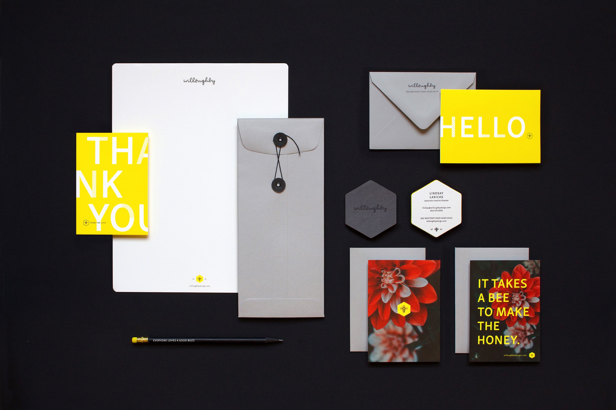
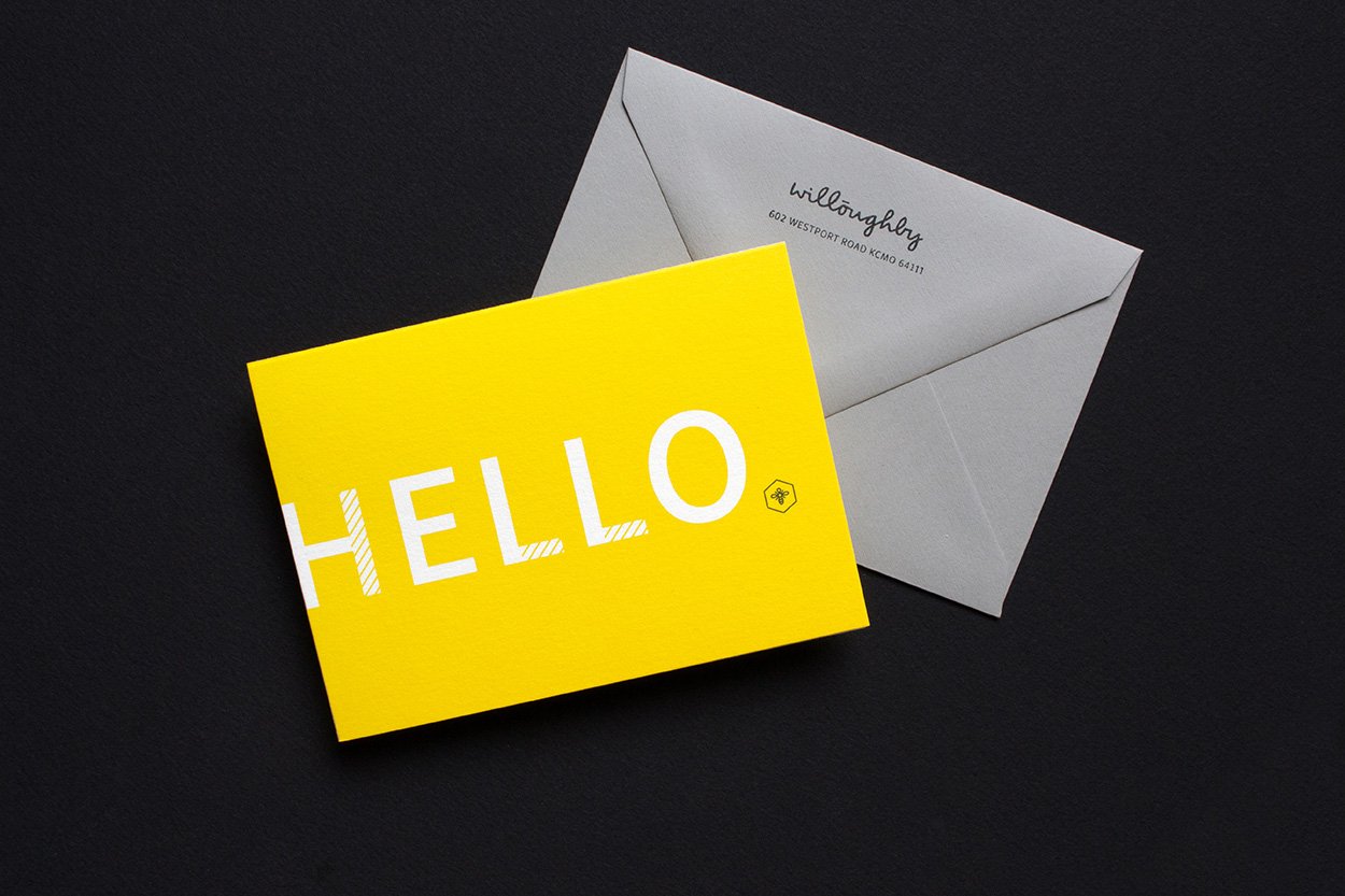
Strategy | Rebranding When ownership of Willoughby Design was transferred to the next generation, a rebrand was needed to signal a bright, new chapter for this well-respected design firm.
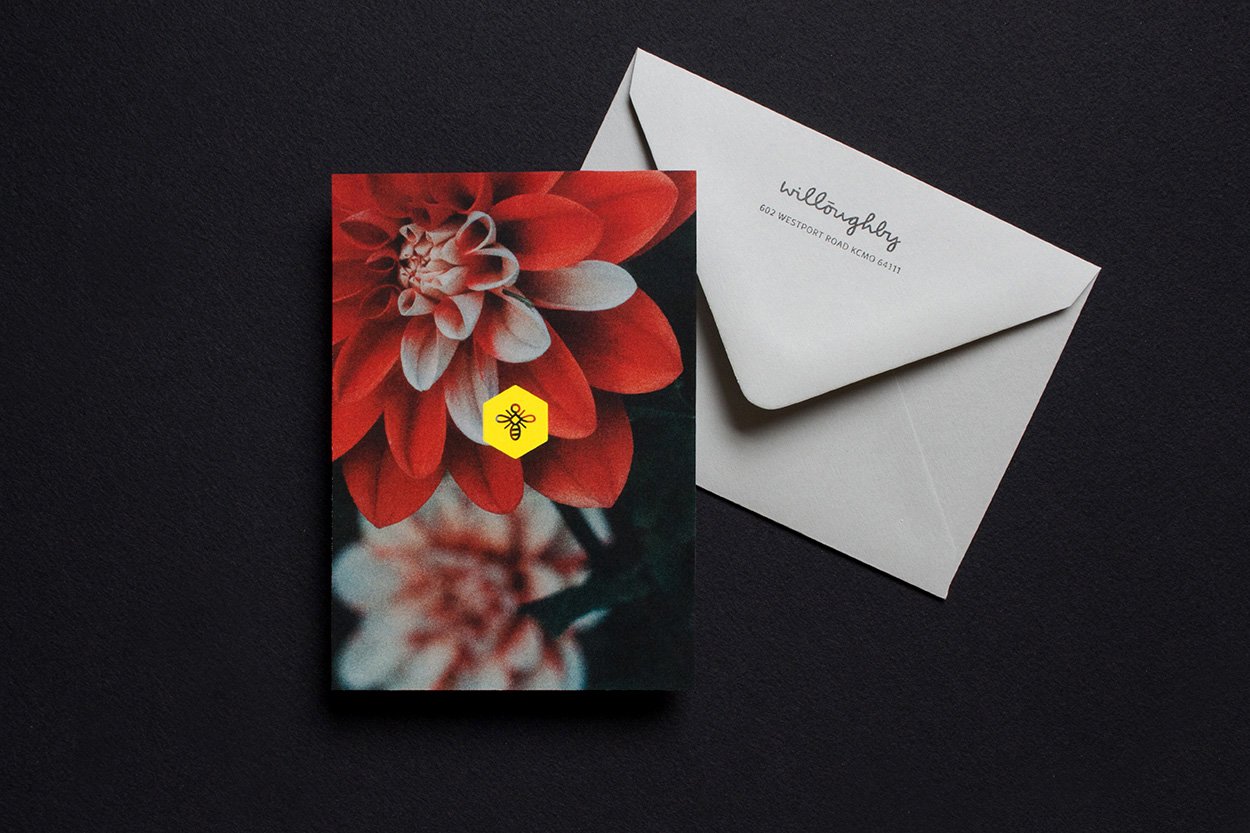
Willoughby is the longest, continuously running, women-owned design firm in the US, so a subtle nod to the women who built (and currently run) this business felt appropriate.
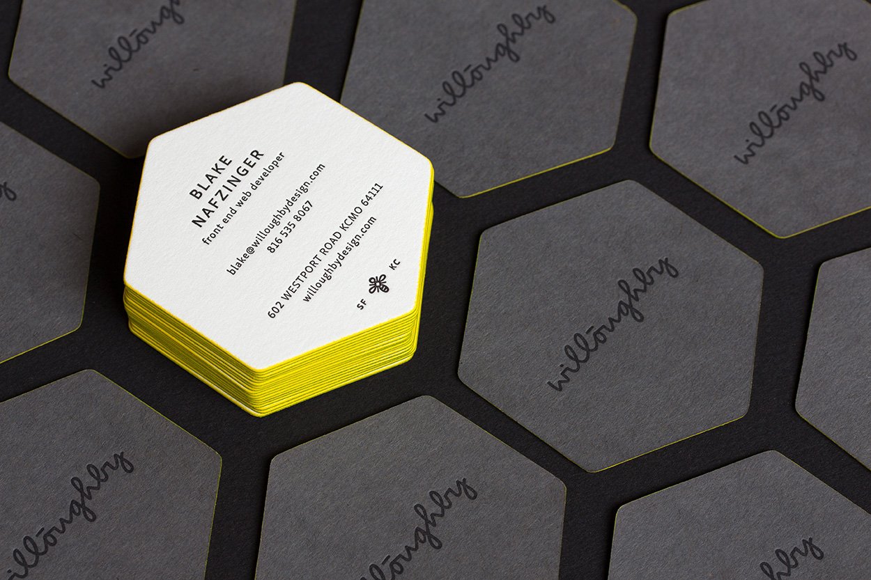
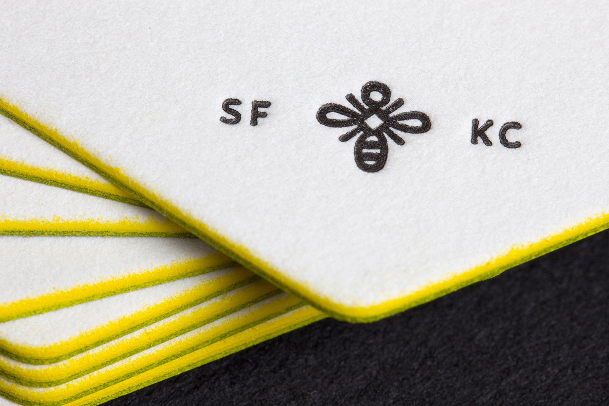
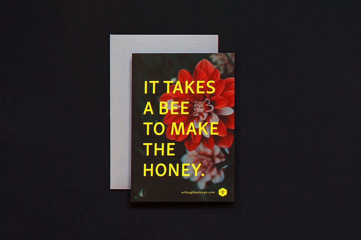
Inspiration was drawn from the matriarchal society of bees. Their intuitive and efficient use of space as well as their creation of a delightful end product made a bee the perfect icon to tell Willoughby’s story. (Plus, they’d been calling themselves ‘the bees’ internally for years, so…)
The new owners, two 20-year(!) employees, wanted a look that was whimsical, sophisticated, clean, smart, and joyful. I was proud to be a part of the identity that will carry this wonderful company into the future.
Work done at Willoughby Design
